
case-study
user experience | user interface
Fix4 Capital
Car repair loans approved instantly and managed directly from your mobile device with funds available to you at the click of a button.
Fix4 Capital lets vehicle owners request a revolving line of credit based on the value of their vehicle, specifically to cover repair costs. The entire application, approval, and repayment process is handled through a mobile app.
Client Fix4 Capital, a fintech startup serving off-warranty vehicle owners
Role UX/UI Designer, working alongside a development team
Timeline About 6 months
Deliverable Full user journey and working prototype, from account creation through loan approval, vehicle management, and payment tracking
Get revolving credit based on the value of your vehicle.
Empathize
This was a new product build. When I joined, Fix4 Capital had a logo and a brand color chart. No existing app, no design system, no prior user research to build from.
The target user is a vehicle owner with lower credit, needing fast cash for a repair they didn’t plan for. Off-warranty repairs are unpredictable and urgent by nature, and this group is often underserved by traditional lenders: bank loans and credit lines are slow, paperwork-heavy, and not built around the specific, recurring need of “my car broke down and I need to fix it now.”
Fix4’s core idea was to make a line of credit tied to vehicle value feel as familiar and fast as using a credit card, but scoped specifically to repairs.
Define
Problem statement
Off-warranty vehicle owners need a fast, low-friction way to access credit for unpredictable repair costs, without the paperwork and wait times of a traditional lender, because a broken-down vehicle often means lost income or lost mobility.
Design problem
How do you make a full loan lifecycle, applying, getting approved, tracking payments, adding vehicles, feel as simple as checking a banking app, while still surfacing enough financial detail (APR, term, payoff value) to keep it transparent and trustworthy?
There were no formal constraints on the project (timeline, compliance, or platform), which gave the design room to be led primarily by user needs rather than technical or legal guardrails.
Ideate
Key decisions and reasoning
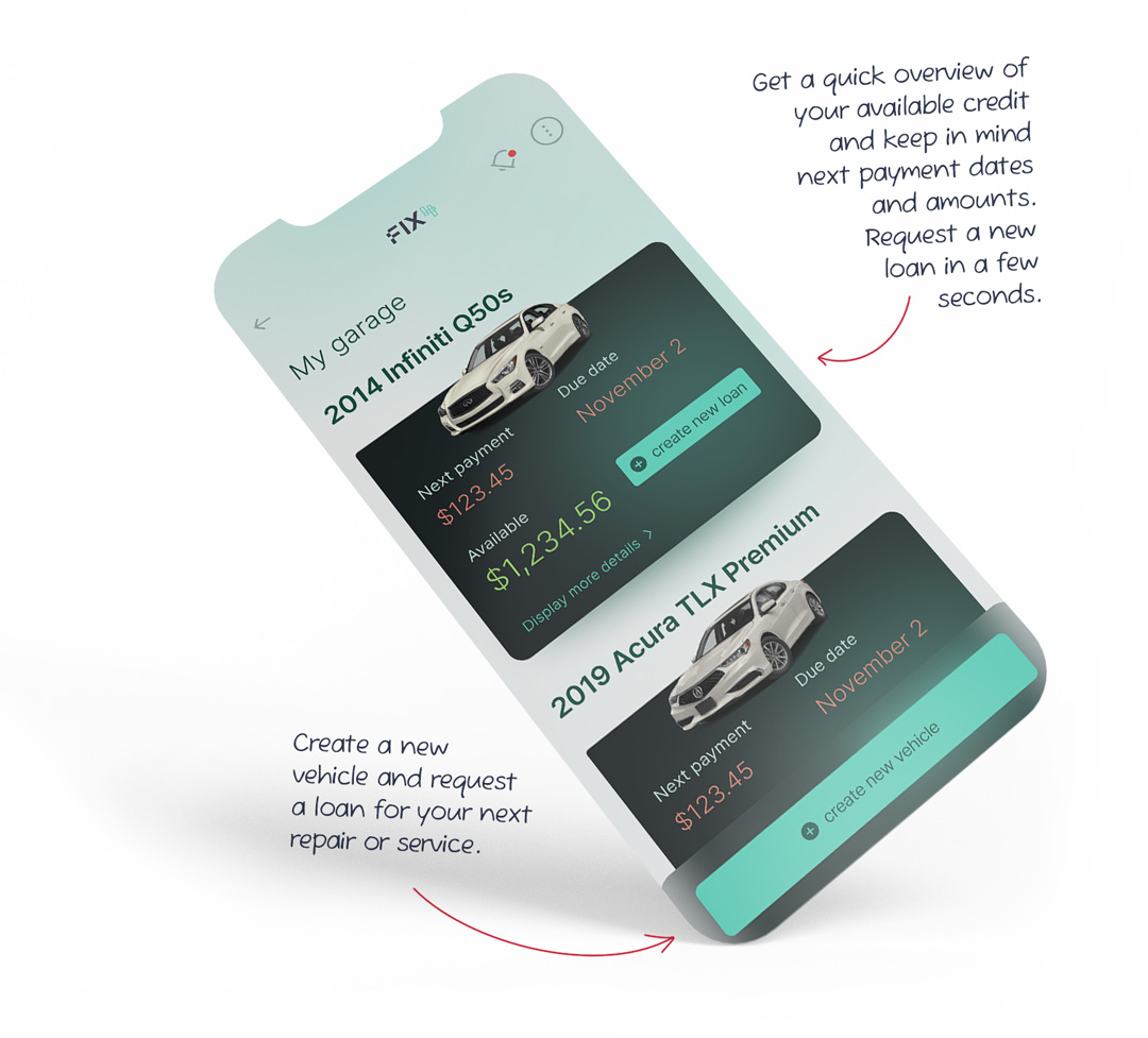
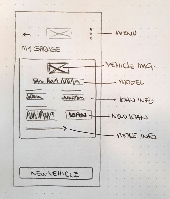
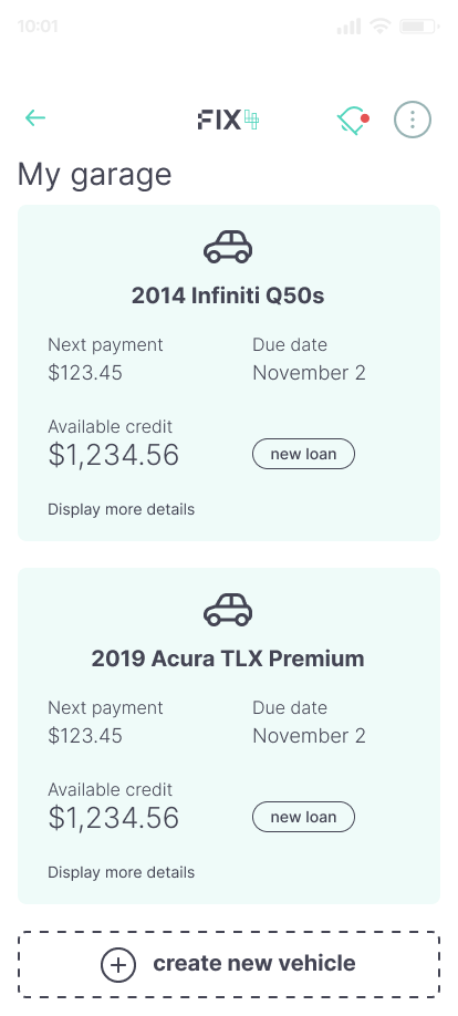
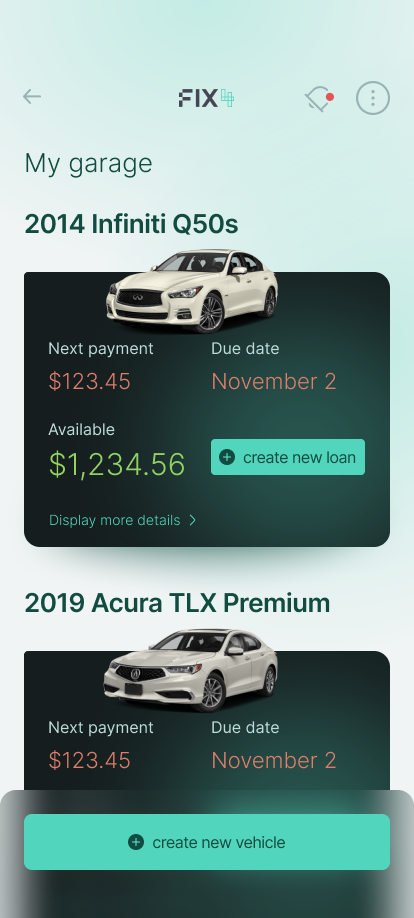
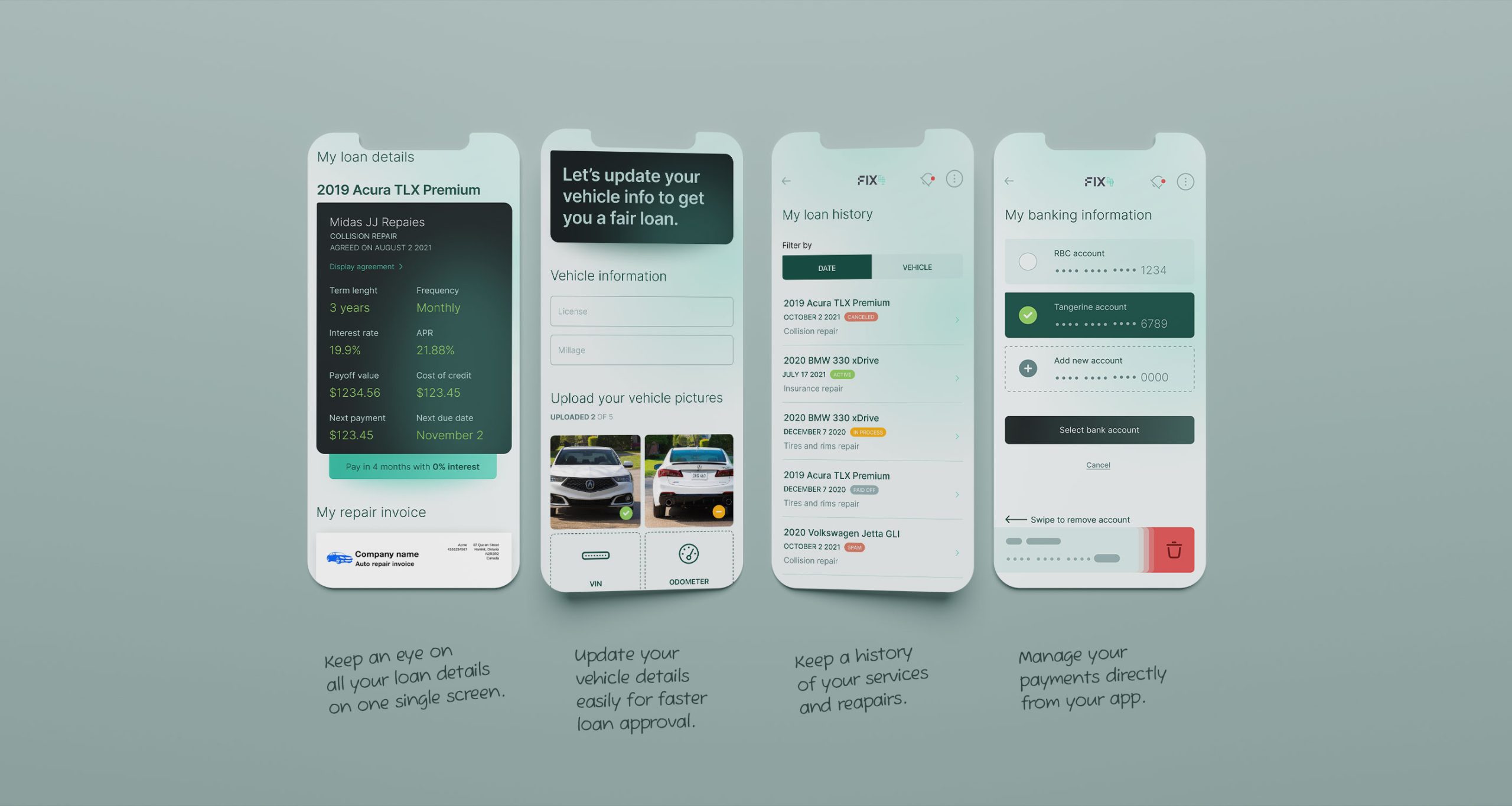
Organize by vehicle, not a single dashboard “My Garage” gives users with multiple vehicles a quick read on next payment date, amount due, and remaining balance for each one, at a glance, without digging into a single merged view.
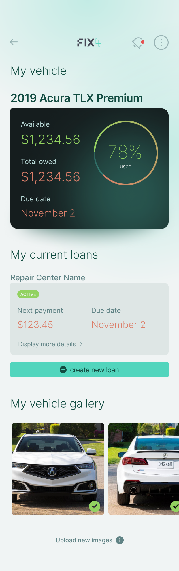
Vehicle detail screen carries the financial weight. Term length, payment frequency, interest rate, APR, and payoff value all live here, keeping the Garage view clean while still giving users full transparency when they want it.
Invoice history tied to the vehicle. If a repair was done at a FIX4 partner garage, past invoices attach directly to that vehicle’s profile, linking financial and service history in one place instead of scattering it across email or paper.
Minimal-friction vehicle onboarding. Adding a vehicle only requires a few photos and basic model info before submission for approval. Since this is the entry point to the entire product, cutting friction here was the priority.
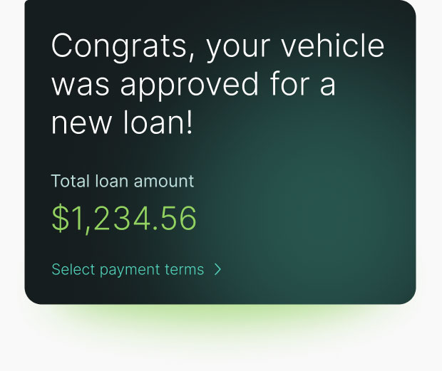
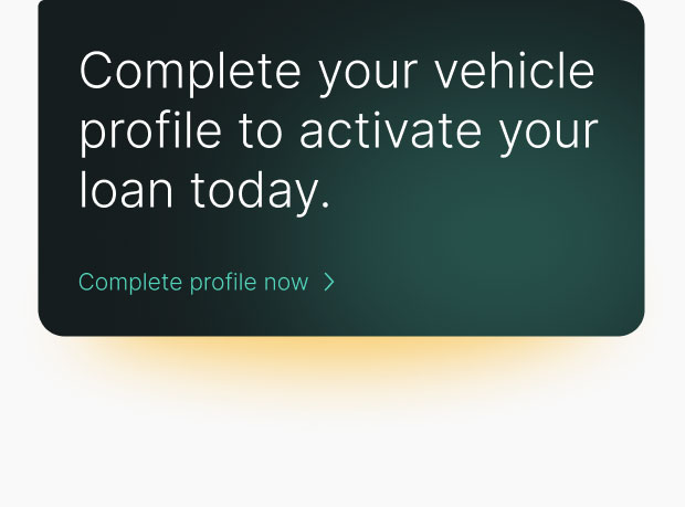
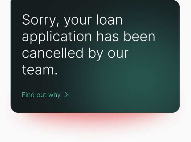
Standard color-coded alerts. Green, orange, red for success, warning, and error, so financial status reads instantly without requiring users to parse text under stress (e.g. a missed payment).
From wireframe to mockup to prototype
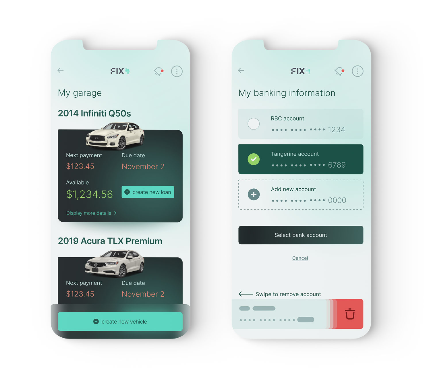
My Garage screen allowing user to track loans for each vehicle.

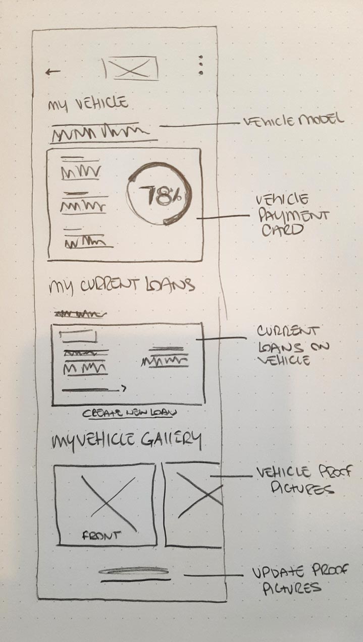
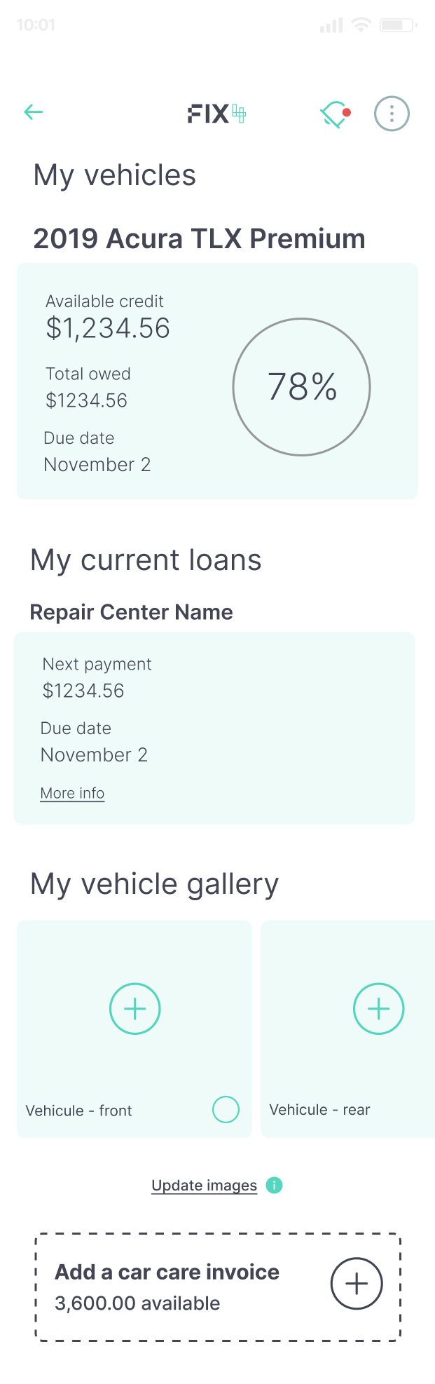
My vehicle screen allowing user to track current and past repair loans for each vehicle.
Make primary actions easily accessible
We want to make it easy and effortless for our users to get approved for a new line of credit within minutes. Paying off the line of credit must be equaly as user friendly.
Your garage
Keep your loans organized by vehicle. Your garage allows you to have a quick rundown of your due dates and amounts of payements. Request a new loan for a vehicle or create a new profile for a new vehicle from the garage screen.
Your walet
Link your banking info to your FIX4 account and manage your payments throught the mobile application. Your wallet will allow you to connect different bank accounts, make extra payements and keep track of your available funds.
Designing a clear notification system to keep user in the know
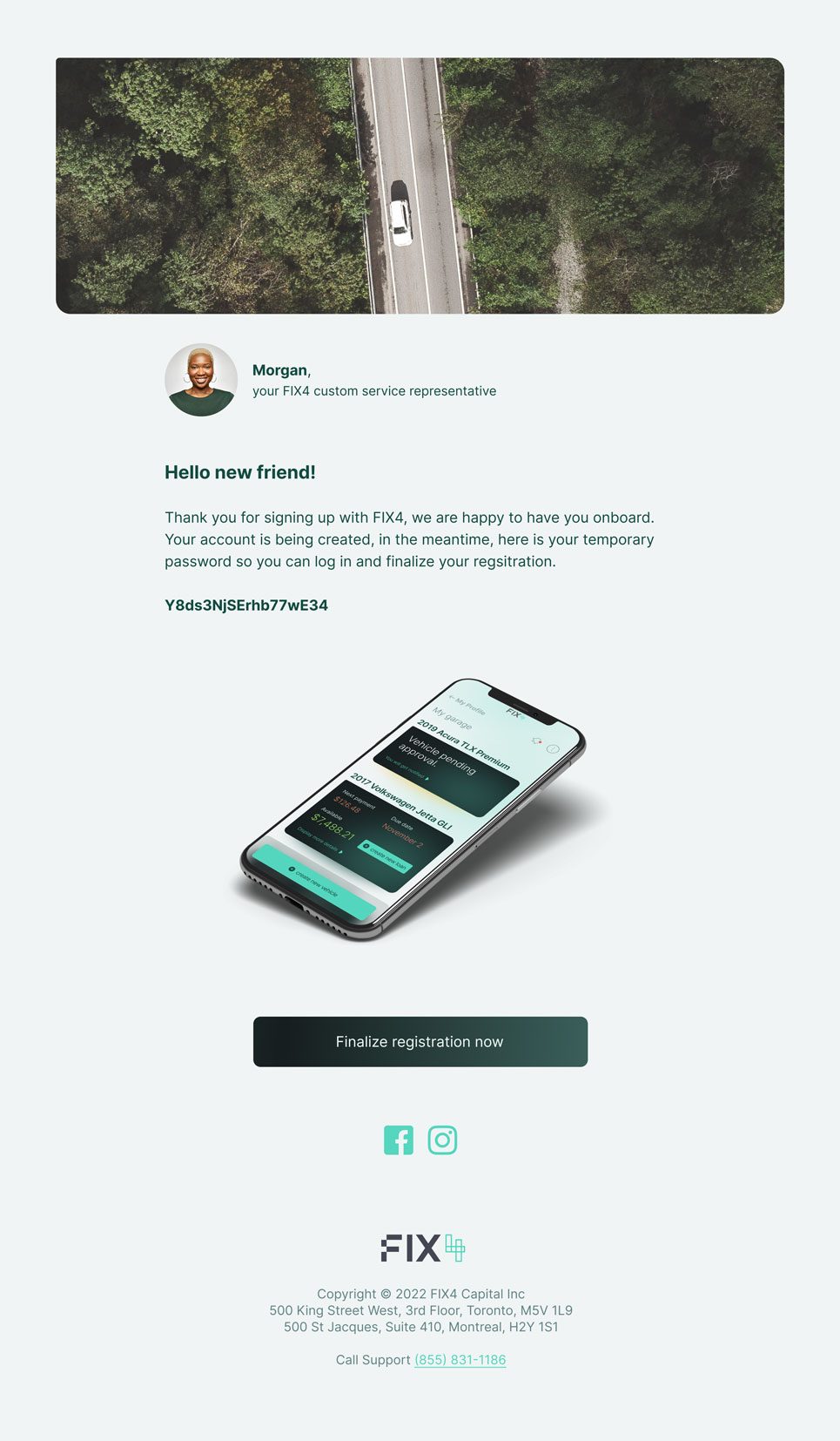
Email template
Success alert
Warning alert
Error alert
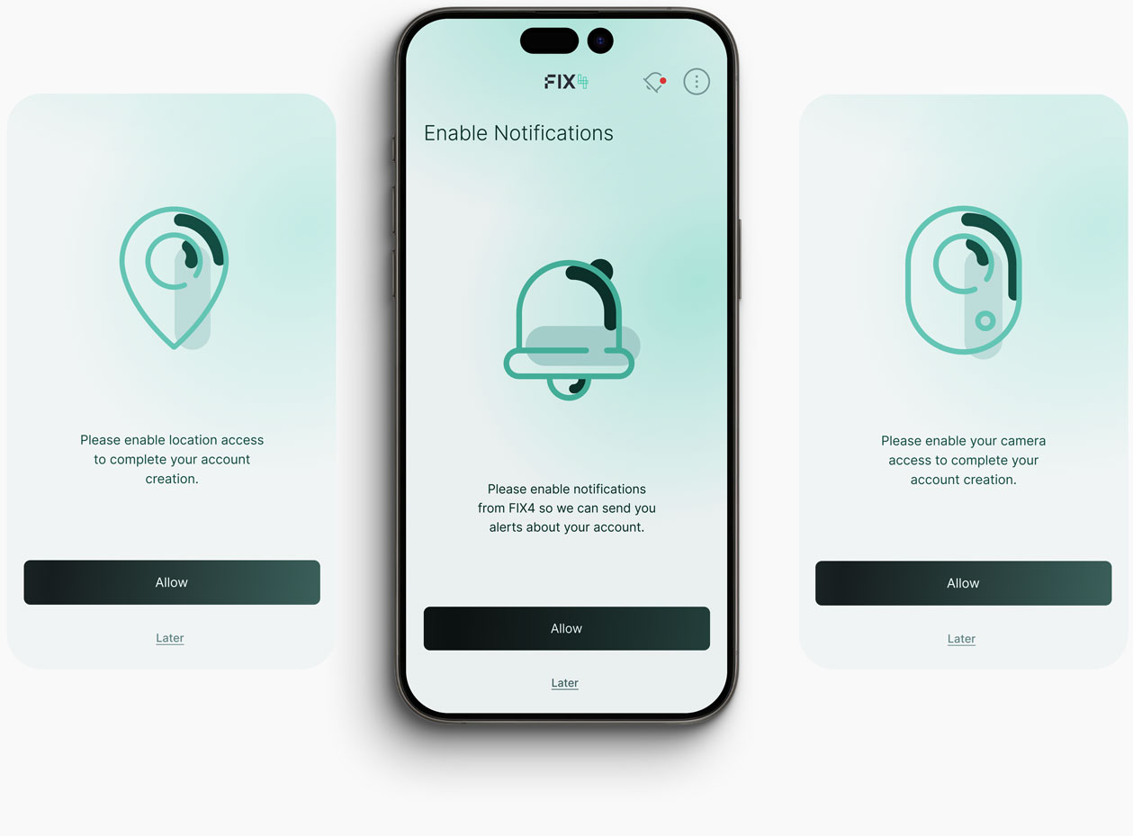
Notifications screens
Solution
The final product covers the full loop: account creation, vehicle onboarding, loan request and approval, per-vehicle payment tracking, wallet management, and a notification system to keep users informed at every step (approval, payment due, payment success, errors).
Result & Impact
The product shipped. Shortly after launch, Fix4 Capital was acquired by a larger US-based company, and the product was discontinued as part of that transition. While this means there’s no long-term usage data to point to, the acquisition itself is a signal: the product got far enough, fast enough, to make the company an acquisition target within roughly six months of a standing start.
Reflexion
Designing a fintech product from zero, no existing research, no design system, no prior patterns, meant the real work was translating unfamiliar financial concepts (APR, revolving credit, term length, payoff value) into something a non-financial user could understand at a glance and trust.
If I ran this again, I’d push earlier for direct testing with actual off-warranty vehicle owners rather than relying solely on internal stakeholder review. Financial products live or die on trust and legibility, and that’s best validated by the people actually applying for the loan, not the team building it.
The project’s ending is a useful reminder too: success in this kind of work isn’t always measured by longevity. Sometimes it’s measured by whether the design helped make the company valuable enough to acquire.